
Quiver Doodles
I don't know if this is still true, but I once read about exploited workers in the ship-breaking industry who were worked so hard, and paid so little, they could not even afford to buy enough calories to sustain themselves. They were slowly starving to death. I call this phenomenon entropic ruin, a generalization of the idea of gambler's ruin to open-ended games that can be non-zero-sum and need not involve gambling. In this case, it's a deterministic death march. If you systematically consume fewer calories than you expend long term, you will die a premature death.
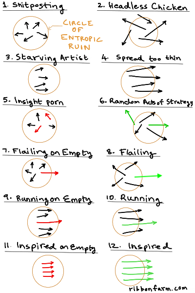
Entropic ruin gives us an interesting way to measure the quality of a strategy. Here's a 12-point reference scale based on the idea. Entropic ruin is represented as a reference circle in all 12 cases. A bunch of arrows shows the set of activities that are trying to outrun ruin. I call the drawings on the scale quiver doodles (think of each as a quiver viewed from above).
Trivially, in the long term, we all face the ultimate case of entropic ruin, death, but what's interesting about non-trivial cases is that you don't even beat the house in the short term. So entropic ruin can be defined as predictably dying faster than you need to. No matter what you are doing, you can draw a little circle of entropic ruin around your activities. If you're inside that circle, you're heading for premature death.
If you have (or are generating) abundance on every resource you might need in relation to your goals, you don't need a strategy. The circle can shrink to zero. This is the other end of the spectrum from entropic ruin: entropic flourishing. A wealthy person who is earning more in interest on their capital than they can spend in a day is an example. The scale is really more of a 6-point scale that zig-zags between entropic ruin and flourishing up 6 levels between complete chaos (Brownian motion) to complete order (laser beam).
If you've been through the ups and downs of enough projects, the 12 quiver doodles on the scale probably make intuitive sense to you, but let me offer a bit of additional explanation for those who need it.
Drawing Quiver Doodles
Each quiver doodle represents a strategic condition of some process or project. It's like looking at a quiver full of arrows from above.You should feel free to get artistic with the doodling vocabulary so long as it has a grammatical interpretation. The scale is just a journey through 12 possible doodles in a larger space.
The rules are simple. The circle of entropic ruin is a sort of budget boundary whose meaning depends on context. It might mean profitability or free cash flow in business. It might mean attrition rate relative to the enemy in war.
The arrows are activities. Their lengths represent their energy generativity levels. A longer arrow is a higher energy activity. Colors indicate information content relative to entropic ruin, and come in pairs. Red/green is the same information, but with ruinous versus flourishing effects. Black indicates an activity driven by no information.
Think of a red arrow as an insight-driven activity that requires investment. A green one as the same arrow once it's delivering returns sufficient to outrun entropic ruin.
Every activity arrow must have at least a part inside the circle. Otherwise it's not grounded in any life/death resource picture and is irrelevant. Generally, the tail should be inside the circle. I'm not sure what an arrow with its head inside the circle would mean. Perhaps it is an introspective activity, inward looking, not capable of generating ruin-outrunning energy.
To plot whatever you're up to on this scale, first draw a quiver doodle, then compare it to the scale. This is a swatch type scale, not a measuring instrument.
To draw a quiver doodle, do a gut check on how correlated your in-scope activities are (directions of arrows), how many of them are driven by entropic-ruin-busting insights rather than just energy or habit (colored versus black), and whether or not the insights are powerful enough to actually get you out of the circle of ruin (red versus green, penny-ante stuff versus big-wins stuff). Then pick the doodle on the scale that looks most like yours. To help you, I've added some evocative names to each stage on the scale.
If it helps, label your arrows. Don't get OCD about it. The point is to draw an impressionistic portrait of how your activities feel to you, not a photorealistic portrait of them.Strategic Boom-Bust Cycles
Entropic ruin versus flourishing is the most important element of the quality of a strategy. It's literally life or death. Everything else must be understood in relation to that. Those other aspects are represented by the arrows in the picture.Examples of entropic ruin besides bodily starvation include rideshare drivers who steadily lose wealth because their income does not cover the depreciation of their vehicle, and people who work on crowd-intelligence tasks that pay so little they don't even make up for electricity and bandwidth costs. In those cases, it is possible to systematically pick strategies that avoid entropic ruin, but many cannot or do not.
Examples of entropic flourishing besides being rich include basic physical growth such as that experienced by a healthy, well-nourished child, or a growing startup past product-market fit.
The circle in a strategy doodle shrinks or expands depending on your resource levels. The circle is abstract potential energy. But smaller means more potential energy, not less (think of the circle as confining or limiting your freedom of action with a resource, so being outside of it means freedom derived from excess potential energy beyond what you need).
There is an obvious feedback cycle here. As the circle shrinks, there is less of an imperative to be thoughtful and strategic about what you're doing, so activities get more random, uncorrelated, and uninsightful. This might in some cases kill the flourishing and expand the circle again, turning green arrows into red ones. Then you rinse and repeat.
That's the logic of a boom-bust cycle.
A strategy is not good or bad in an absolute sense, but only in relation to the current entropic ruin horizon. Simply by loosening prevailing resource use rate constraints -- time, energy, money and so forth, a strategy can go from ruinous (left) to flourishing (right) or back.
If you have a lot of money, you may be able to simply throw money at a problem for example. If you have a lot of time, you can just try a lot of random trial and error. A headless chicken looking for a head.
A normally ruinous activity can be turned into play by shrinking the circle. Video games give you n>1 lives, and remove the prospect of physical death, and thereby turn war into play.The Scale
This is, as I said, a 6-point zig-zag scale. Each level goes from ruin to flourishing. Odd-numbered levels are ruin states, even-numbered ones are flourishing states. Projects often evolve straight up and down the scale, but it's not necessarily. There can be jumpings-around.Levels 1 and 2, shitposting to headless chicken, correspond to states where your activities are being driven primarily by energy rather than information, and have no necessary correlation to each other or even mutual awareness.
Levels 3 and 4, starving artist to spread too thin, have an element of mutual correlation. Either through shared function, structure or behaviors, they become informationally connected, but don't necessarily have an insight driving them or a meaning to their shared direction. This is the state we often call tactics without strategy, like a flock of starlings flying around in a murmuration. Correlation means just that: aspects of one activity can predict aspects of another. Don't assume correlation equals logical connectedness or dependence. Or even meaningfulness. We're not necessarily talking planning. Cargo cults, ritual states, etc. belong at these two levels.
Levels 5 and 6, insight porn to random acts of strategy feature thought entering the picture. There are aha! insights shaping some, but not all activities, and the insights driving activities have no necessary relation to each other. It's just a bunch of unrelated good ideas that may or may not be actually capable of outrunning ruin. This is still not strategic because experimental trial-and-error actions might have happened driven by insights, but choices haven't been made. This is a picture of strategic optionality. Choices are available to be made. Usually, when information enters a picture, previously correlated activities lose their correlation, as arrows turn to conform to the logic of an exogeneous idea rather than the logic of mutual internal correlation. It's not yet strategic, but it's no longer purely tactical.
Levels 7 and 8, flailing to flailing on empty, are the beginnings of true strategy. Bets have been placed, and options have been committed to. Risk has been taken on. But it is flailing because the logic of the decisions hasn't suffused all other activities. This may or may not lead to entropic ruin. If your driving insight is powerful enough, it can overcome the friction and drag of a lot of flailing in other activities. If you get one thing very right, you may not care. A shitshow is basically a condition like shitposting except for one activity that might potentially be able to pay for the drag of the rest.
Levels 9 and 10, running on empty to running, represent a functional strategy at work. Options have been chosen, and all activities aligned to those choices. If it is a good strategy, you'll be able to transition from 9 to 10 under deliberate control, as the activity generates its own fuel and goes from empty to full. Sometimes it might need fuel from elsewhere for a while till it becomes self sustaining.
Levels 11 and 12, inspired on empty to inspired, represent a condition that goes beyond mere alignment of activities to a sort of holographic harmony, where it's all strategy. Mind like water. Many people who think strategy and tactics are distinct types of actions don't get the logic of this condition. The trick is to recognize that strategy inheres not in the nature of an activity but its meaning. The state of an arrow having a color, not just length and direction. Two activities that both contribute to the full meaning of a situation can both be equally strategic even if they are very different in other ways. What makes an activity not strategic is if you can substitute another one for it without disturbing anything else.
There's probably a tired/wired/inspired joke relating to levels 9-12, but I am too tired to figure it out.
Interestingly, this diagram (and therefore this post) itself began life as a twitter shitpost doodle, and then it evolved in quality to become level-5 insight porn. The key idea that leveled it up was that of the circle of entropic ruin.
If it gets popular and makes me money, it might ride further up the scale. Hey maybe quiver doodles can somehow be used to represent play states in video games.Portfolios
Activity sets become portfolios when they don't all belong in the same strategic bundle, but do belong in the same quiver.The possibilities of this kind of strategic condition doodling go beyond what I've shown to portfolios. I think it would become intractable very quickly and turn into a kind of counterproductive chart porn, but it's useful to at least extend the logic of the doodling conceptually, even if we don't use these extensions.
The scale represents the evolutionary boom-bust space of a single strategy. So you can of course have multiple strategies driving multiple activities within a single portfolio that shares a budget/entropic ruin circle/quiver.
If you want to plot those in the same doodle, use different pairs of colors for each. So green/red might be your work strategy and blue/yellow might be your personal life strategy. The two arrow flows in their respective inspired stages would be pointing in different directions, since they are driven by different core insights.
Synergies and antergies can be represented by mixing up the colors using parallel stems of different colors. Make the stems solid or dotted depending on whether it's one or the other. This sounds clumsy and you should probably switch visualization strategy if you need to do this. I was trying to incorporate the logic of magnetic domains and frustrated spin systems for that here, but I don't think that works.
Another interesting idea to consider is changing the shape of the entropic ruin horizon from a circle to something else. If every compass direction represents a resource regeneration vector, then you could turn the ruin circle into a sort of resource spider chart. For example, north-south might be money, and east-west might be time. Again, remember, smaller is higher potential energy. So if you have tons of money, the circle becomes a very skinny ellipse, almost a line.
This could run into trouble since it would identify specific strategies with specific resource regenerations. If that makes sense, it's all well and good. If not, the abstract "potential energy" of a particular strategy should probably define the direction, whether or not it has an interpretation like "money" or "time".
2 Comments
As always, fascinating stuff. I haven’t read your blog in years since my company blocked it due to some ignorant automated ruleset. I’m glad I found you’re book while sorting boxes, because it inspired me to search for Ribbonfarm.com again.
This is a very exciting idea. What if, instead of a spider chart, each resource has its own horizon? That would eliminate the problem of connecting certain strategies to certain resources.