How to Draw and Judge Quadrant Diagrams
The quadrant diagram has achieved the status of an intellectual farce. If you, as a presenter, do not make an ironic joke when you throw one on the screen, you will automatically lose a lot of credibility. For some very good reasons though, the diagram is an indispensable one for the presenter's toolkit. As a listener, if you have a default dismissive attitude towards the thing, you will have to sit out far too many important conversations with a cynical, superior smile. So here's a quick tutorial on quadrant diagrams. I'll tell you both how to make them, and how to evaluate them. Here's a made-up one to get the basics clear. You basically take two spectra (or watersheds) relevant to a complex issue, simplify each down to a black/white dichotomy, and label the four quadrants you produce, like so:
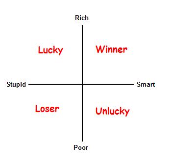
This particular one is nonsense, and falls apart at the slightest poking (we'll poke later in the article), and I made it up for fun. Let us discuss three real examples from business books before we develop a critical theory and design principles. The three I will use are from The Power of Full Engagement by Jim Loehr and Tony Schwartz, Making It All Work by David Allen, and Listening to the Future by Dan Rasmus and Rob Salkowitz.
The "Dynamics of Energy"
The Power of Full Engagement by Jim Loehr and Tony Schwartz is a pretty neat little self-improvement book that is based on the premise that managing energy is more important than managing time, and that we should do so the way top athletes do: by balancing training and performance. The book offers this quadrant diagram:
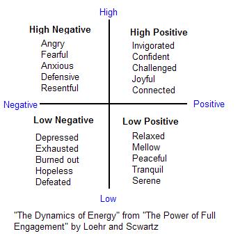
This example illustrates the difficulty of working with complex, ambiguous multi-faceted issues. Energy at the level of physics is well-defined, but when we are talking about the more ambiguous sort that goes with people's behaviors, there are a lot of nuances. The book itself discusses several other aspects, like a classification into "physical," "emotional" and "spiritual" energy.
Notice one thing about the quadrants: they do not have evocative names, but mere structural labels like "high positive" alongside lists of features, which are clearly variables deemed to be of lesser importance, but too important to leave out. The diagram picks out two specific attributes out of the ambiguity: subjective intensity and pleasantness, for highlighting. While this is a reasonable thing to do, it is not a necessary choice. You could defend these choices, but they do not seem particularly compelling. Why not, you might ask, "steady" vs. "spiky" energy, or "physical" and "mental" energies? The choices are also weakened by the low chemistry between the two variables.
You would not expect this diagram to support a conceptually strong theory, and it doesn't. The book stakes its credibility on case studies and anecdotes, and fortunately, the structural strength of this diagram is not tested. This is basically a quick-and-dirty conceptual framework for organizing subject matter and ideas that are largely empirical in origin. This should not be surprising, since the source of the books ideas is data from performance coaching of athletes and executives.
Overall, this one rates a C-. As I will argue, it uses a quadrant for the wrong material, and does so poorly at that (the book itself is decent though).
The "Self-Management Matrix"
Moving to a more analytical, concept-driven quadrant, consider this one, from David Allen's Making It All Work, a reflective analysis of his earlier book, Getting Things Done (GTD).
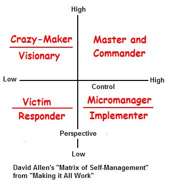
This diagram is an immediate improvement over the previous one on two fronts: the quadrants get evocative labels, and the chosen dichotomies along the x and y axes: perspective and control, rather than seeming like arbitrary "lead" variables plucked out of a list of many, have a yin-yang fundamental quality to them. The evocative labels serve an important function. Unlike "High-high," the phrase "Master and commander" picks out a prototypical example of being in the state of high perspective and high control. It at once suggests more implied complexity than the long feature lists in the Loehr/Schwarz diagram, while retaining coherence which the Loehr/Schwarz diagram lacks. You get the sense that while each quadrant is a fuzzy set, they do represent fundamental "pure" types. Though we are not talking math or rigorous logic here, you would accept perspective/control as metaphysically foundational concepts, rather like Euclid's axioms. You are willing to make a leap of faith and assume the pair as basic, important dichotomies.
This diagram, unlike the previous one, is the result of a more deliberate effort at fundamental analysis. More thought has gone into it and you could (and Allen does) build more of a sound theory on top of it. This is also not surprising, because though the diagram is based on the empirically validated GTD methodology, the methodology itself grew out of conceptual analysis, not data analysis.
This diagram rates a B+. Pretty decent. Points lost for insufficient qualification of the rigor of the argument.
The Microsoft Scenarios
Our last example is from business strategy rather than self-improvement, and is a diagram that organizes four "future of the world" scenarios that Microsoft uses to test its strategies, and is the basis of Listening to the Future by Dan Rasmus and Rob Salkowitz. The diagram is used for scenario planning, and the idea is that if a strategy seems robust to the four scenarios (the metaphor used is "wind tunnel testing"), then it is a good strategy. Here's the diagram:
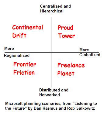
This is perhaps the most interesting one of the three. The diagram takes on the formidable task of thinking about the future of the entire planet. The framework is based neither on experimental/field data (we are talking about the future, the product of thousands of trends gathering momentum today, and uncertainties that nobody can guess at), nor is it conceptual in origin. There is no possible fundamental theory that would tell you that globalization and labor market organization are the two "most important." Maybe the important ones are the evolution of Islam, water wars or the global aging population. The choices made here are essentially artistic ones, not statistical "key indicators" or first-principles self-evident concepts. Though globalization and labor dynamics are important, they simply are not metaphysically primitive constructs like "control" or "perspective" (or "line" and "point"). Instead, they represent observable patterns at the other end, the most complex sorts of patterns we can process and understand, what we call mega-trends.
Which is why the labels in this diagram are crucially important. They go beyond evocative to purely artistic. They suggest entire stories and science-fiction trilogies. At the risk of sounding like a bad fiction reviewer, I'd call the quadrant names "rich background tapestries." What's more, the supporting text provides the right sort of nuanced and ironic meta-analysis of the diagram itself.
This rates an A grade.
When Should You Use a Quadrant Diagram?
In summary, the three diagrams rate C-, B+ and A. The grades are a reflection of both the difficulty of applying quadrant diagrams to the source material in the particular cases, as well as the effectiveness of the actual application. Let's create a quadrant diagram to illustrate when to use quadrant diagrams, and when to do something else.
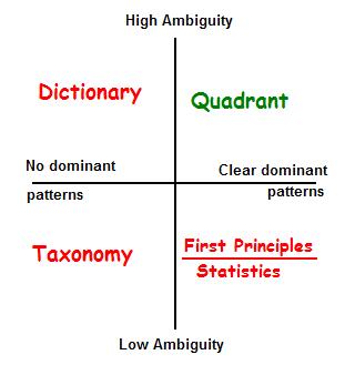 The key is to use it when there is high ambiguity, overlap and fuzziness in the basic categories, and apparent high-dimensionality (lots of variables with complex coupling) but somehow, when they mix together, a few dominant patterns leap out. In the soup that is "predicting the future of the world," despite the complexity, a few things obviously leap out, like "climate change" and "globalization," as useful top-level constructs. In talking metaphysics of being, somehow "yin" and "yang" capture something important.
If the concepts were clearer, and dominant patterns were visible (bottom right) you would either be able to apply first-principles analysis and identify the foundational concepts, axioms and inference rules, OR you would be able to measure things and apply statistical techniques like regression, principal component analysis and clustering. Imagine a contemporary of Euclid offering a quadrant diagram with "closed/open" on one axis and "small/big" on the other, and marking the quadrants "lake", "river", "speck of dust" and "hair." He would have been blasted away by Euclid's more fundamental point/line approach. Similarly, the dumb example I opened with (rich/poor, smart/stupid) begs for statistical analysis, because it lazily uses an unnecessary quadrant diagram for stuff that would yield to systematic number-crunching (IQ/personality types/wealth correlations). The Loehr/Schwarz diagram is interesting because it is on the cusp between statistical tractability and intractability. The book's source material is just coherent enough that you get the feeling a good statistician could have eliminated the need for the quadrant diagram. A good part of the blame for the low grade of the diagram is that the material should not have been quadrantized in the first place.
If things are ambiguous and no dominant patterns leap out (top left) , you are better off creating a dictionary or glossary of example "types" to illustrate diversity and differentiation within the soup of ambiguity. This can mean case studies, collections of anecdotes or examples, and so forth. If concepts are clear-edged, but nothing seems any more important than anything else, the material is ripe for a taxonomist. Which is why the alchemists, with their earth/fire/water/air/ether model did quite well, as did the periodic-table folks, before the subject of chemistry yielded to fundamental analysis at the level of physics. The same goes for Carolus Linnaeus and his binomial nomenclature, before the double-helix came along. Most taxonomies though, will never find a more fundamental layer below the arbitrary one.
If you DO use a Quadrant Diagram
If you ARE in the top right quadrant, you still have work to do. Your primary job is to identify four interesting and complex clusters of phenomenology, without the aid of statistical or first-principles analysis, and think up two interesting lines that will separate them. These are the dominant patterns, and the organizing spectra/watersheds. You are effectively doing right-brained statistics and first-principles guesswork.
If your lines end up being spectra, or related to each other in nice ways (for example, the perception/control dualism), that's a bonus. The Microsoft example is interesting because the two axes do not represent simple spectra. Between hierarchy and decentralization, a lot of variables change.
The value of your diagram will be validated by your ability to think up evocative names for the quadrants. If people see your diagram and instantly feel a sense of relief and recognition, it means you are articulating and clarifying something they've already subconsciously noticed. Naming is important in other ways as well. Structural indicators like "high/low" as in the Schwarz/Loehr diagram put people on their guard, because they recognize that you are shoehorning a multidimensional issue into two dimensions. The list of additional qualifiers makes things worse, since it suggests you are ignoring complex couplings. All adjectives, no nouns. Evocative names, on the other hand, suggest complexity, as well as soundness/coherence.
Finally, depending on your source material, you will need different types of evocative names for your quadrants, and different types of supporting qualitative commentary. Here is a quadrant on how to do quadrants:
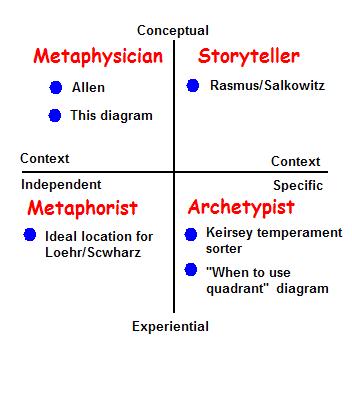
Remember, if you are doing quadrants at all, you are in the ambiguous/dominant patterns zone. If you are playing with seriously conceptual stuff (things like "yin/yang" and "center/periphery") that people understand intellectually in the abstract, you are in the top half. If you are dealing with things individuals and groups experience, and can relate to specific memories, histories, or entities they've encountered, you are in the bottom half. If you are dealing with things that seem like they could apply to green aliens in the Andromeda galaxy (say "being/becoming" or "light/dark"), you are in the left half. If you are dealing with things like "global warming" or "jerks who talk too much at parties," you are tied to the specific, path-dependent history of planet earth and the unique attributes of homo sapiens, and are in the right half.
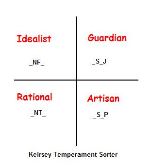
You already know you need evocative labels. This quadrant tells you what types of evocative labels to manufacture, and how to support the diagram with argumentation. If you are in the top right, you have to make up names that sound like high-concept Hollywood movie names, and be prepared to tell imaginary stories: what-ifs about possible worlds. If you are in the bottom right, be prepared to provide examples of real people, events and places. You want to talk about "classic" (or archetypal) members of the quadrant. You might give them abstract names, but you should be able to map the abstract names to real examples, as I did in the previous section. A good real-world example of such an archetypal quadrant is the Keirsey temperament sorter, that lumps the 16 possible Myers-Briggs types (based on 4 variables) into four groups called "temperaments." This diagram is particularly interesting because each quadrant holds two variables constant, and two variable, which means the axes do not represent anything simple (work out the axial logic if you are really curious).
Continuing clockwise, in the lower left, you have experienced abstractions, which yield best to metaphor. If Loehr/Schwarz had read this article, they might have named their quadrants (clockwise from top-left) something like "Mind like water," "Evening on the beach," "Ghost town" and "Hurricane Katrina." The point isn't to be cute. It is to suggest a pattern of complexity, and a calibration/benchmark point, without a hopeless attempt to list all the attributes that create the complexity. But of course, the Loehr/Schwarz diagram is a poor quadrant candidate in the first place. It is better as statistics fodder.
Finally, in the top left, we have metaphysics. David Allen's diagram, rather schizophrenically, uses both archetype labels (master and commander, crazy-maker) and metaphysical ones (implementer, visionary). If this confuses you, think of it this way: archetypes are thumbnail portraits of an entire typical entity. Metaphysical categories emphasize a fundamental/dominant attribute. A Crazymaker is a very richly defined image that says far more than the label "visionary" (which could be good/bad). Things are clearer if you pick just one type, and when in doubt, go more right-brained. This has already happened: crazymaker, victim and micromanager have already become the preferred terms in the discussions of Allen's diagram. I still put his diagram in the "Metaphysician" category though, since I think he is working with context-free categories (perspective/control) that are not restricted to humans. The Keirsey diagram, by contrast, is more closely tied to human psychology.
Evaluating Quadrants
The discussion so far should suggest obvious evaluation criteria. First ask the question: should this be a quadrant diagram at all? If not, probe the speaker with respect to the quadrant of the "should this be a quadrant diagram" diagram where you think the subject belongs. Ask statistical, first-principles, variety and taxonomy questions as appropriate. If quadrants are indeed appropriate. Apply the second quadrant diagram to classify what you are looking at, and look for or ask for the right sort of supporting argumentation. A speaker talking about global warming swamping coastal cities and citing examples of historical floods is providing the wrong sort of evidence: even the worst localized flooding in known history is not the right sort of reference point. You need something like an imaginative science fiction story.
Wrapping Up: Other Diagrams
Visual constructs live in a special sweet spot inhabited by issues that are too complex for rigorous analysis, and too structured or impoverished to support full-blown narrative treatments in the form of novels or stories. Within this universe, quadrant diagrams are in the Goldilocks position. One dimension (spectrum scales and circular "life cycles") is fairly limiting and needs a lot of verbal support. Three dimensions gets you to a place where sheer visual processing overshadows the content of what you are saying. There are also interesting special cases like triangles. Beyond that, you are reduced to things that start to look quantitative or operational: multiple sliders on scales, tables, and flow charts. Beyond that, qualitative analysis through stories and metaphor is the only thing that will work.
So appreciate the quadrant diagram. In the right hands, it defuses polarizations, reframes arguments, separates out coherent alternatives and makes everybody's life a lot easier. In the wrong hands, it produces amusement, supplies fodder for Dilbert jokes, and gives mediocre consultants a picturesque path for their descent into madness.

6 Comments
This is a terrific and powerfully useful analysis of a tool I and so many others use so often. It's great to have a careful analysis of it, clarifying what we come up against in its use. Well done
Great start to a topic that needs a critical review. Short post--by ribbonfarm standards?
I was surprised to find no mention of many popular grids, including two organizations making a lot of money for years using 2X2 grids: Grid International and Gartner.
The managerial grid was a useful and simple way to get managers in the 1960s to balance between task-orientation and people-orientation. Now they conduct five-day management programmes around it!?
While Gartner's use of plotting vision completeness and ability to execute, along with names for each quadrant, may fulfil usefulness criteria you have listed, the only "magic" seems to be how they have "milked this cash cow" (to use a metaphor from another famous old grid, the BCG Growth-share matrix), as a "proprietary research tool".
From the above two, one could formulate (ahem, readers, you heard this here first) Grid Principle #1: Grids generate serious moolah!
An interesting-looking parody on grids is at http://www.valleyofthegeeks.com/News/GartnerQuadrant.html
Part of its ubiquity and popularity in the softer areas involving open-ended conceptual analysis is its sheer simplicity and ease of drawing. The 2X2 grid pampers to our tendency for either-or binary thinking. By drawing attention on two such dualities and attempting to bring a mini Aha when we look at the four combinations, it is able to create a feeling of gaining new insight to a lot of people.
The Johari window has also survived as a cognitive psychology tool to analyze one's openness and interaction with other people.
The four stages of learning a skill is often depicted in the form of a 2X2 grid plotting unconscious/conscious and incompetence/competence.
Every Time Management 101 class or book uses an urgency-importance 2X2 grid, now made even more famous by Covey of 7 Habits fame. I can never remember :-( whether I should worry about Quadrant III or Quadrant II because every time I see someone draw it, they plot and number the grid differently :-)
The problem with this grid is that two of the quadrants (high-high and low-low) warrant no attention or explanation. Grids where one of the quadrants is "not applicable" are the worst.
I believe I have encountered 3X3 grids ("tables"? And almost never 2X3 or 3X2--why?) but they seem to cross the limit of simplicity for most people and haven't endured.
Compared to the high-low of Gartner's or managerial grid, Johari window and the learning stages grid use absolute opposites, like present/absent. This does seem to favor the grid treatment, though I would add, especially or only when all four quadrants have meaning. Arguable, is/is-not could be seen as an extreme version of high/low.
While high/low could be a warning signal, that may still be a part of a useful grid, one example being some of the variants of situational leadership models.
Methinks, it is optional for evocative naming of quadrants for the grid to have value--the learning stages grid is an example. Johari would be illuminating even without the names it uses like Arena and Facade.
To summarize my list of criteria for useful grids:
1. The axes should be independent parameters
2. All four quadrants should be applicable
3. The mini Aha generated by considering the four combinations should lead to distinct implications for each of the quadrants
In general, if someone uses a grid to aspects already analyzed and understood, it may prove less popular than if a grid happens to be used to focus attention on two important parameters and considering them in conjunction. In most of the famous grid examples above, the latter seems to be the case.
Hi Ganesh, thanks for posting the additional examples. I was actually not aware of some of them. Gartner, I left out because I view their use as presentation of stats rather than purely conceptual. I see your point about evocative naming not being necessary. I think this would be especially true when the axes are true either/or dichtomies.
I think you are also right about familiarity and juxtaposition.
One thing that occurs to me that needs some thought is that in the common low/hi+low/hi symmetrical case, the top right hi-hi quadrant always represents the preferred "optimal" zone of performance, as in the Schwarz/Loehr case. This immediately suggests that there is always a Pareto boundary in such cases, which makes the hi/hi quadrant hard to be stable in.
And yes; shorter than usual. Am trying to see if I can drive my average down :)
Yes, Gartner is essentially selling their view of a set of vendors but the decision to base their matrix on the vision-execution axes is their conceptual creation, which can be analyzed for its merits/demerits independent of who they put where based on what data.
(For convenience of discussing without images, all grids discussed below are assumed to be plotted as two points each on the X and Y axis growing on the right and up respectively. So we have X1, X2, Y1, Y2 where X2-Y2 is the usual High-High on the top right.
Incidentally I think most grids are this way though some show the Y axis growing downward, whereas your discussion started with drawing intersecting lines creating four squares. Interesting to reflect whether this affects the analysis in cases where we have the choice of representation. In Low-High cases, the positive graph is the obvious correct depiction but in Is-Is Not cases we have choice.)
High-High does not *always* represent the preferred or optimal zone. Two of the well-established grids do not proceed from X1-Y1 to X2-Y2.
In the situational leadership grid plotting low-high of directive and supportive behavior, the progression is from X2-Y1 (quadrant labeled Directing) to X1-Y1 (quadrant labeled Delegating). One of many examples can be seen here.
In the learning stages grid the optimal is to move from X1-Y1 to X2-Y1 and not X2-Y2, which is clearly an intermediate stage (conscious competence). While the typical image of this is like the one here, my suggestion is to look at the brilliant improvement (with evocative names) at Conversaction where there are other interesting snippets on visual thinking.
Visual thinking, which you have written about earlier, deserves many more posts as I think it is an emerging new field by itself. One interesting effort is WikIT. Though it currently seems biased towards mind maps, I found useful material such as the comparison between mind maps and concept maps.
Your post talks of the "right" pair of parameters for the axes. That is a clinching criterion for the utility of a quadrant diagram. Unfortunately we cannot always easily determine whether there is a better alternative, or if some other important dimension is left out, though we may be able to find fault (e.g. inter-related, less relevant) with some pairs. The problem is the difference between design thinking and analysis thinking. The mind can more readily compare something to known patterns and categorize/label it than identify something missing. In a way, this probably explains the popularity of anything presented in quadrants (especially with names like analytical framework and mental model) and also hints at why some simplistic two-dimensional grid-ifying leaves us dissatisfied.
Okay, now you've officially added more value to this discussion than I did with my original post :)
I do have a list of visual thinking topics I want to cover, interleaved with my queue of less philosophical pieces.
Mind maps/bubble charts etc. interest me a lot, but not in the usual way. People like Tony Buzan have tried to codify and "teach" mindmapping as a discipline, which I think is misguided (not to attempt laying claim to 'inventing' the thing, which makes about as much sense as claiming to have 'invented' breathing). I have been sort of groping towards my 'angle' on the subject, but haven't gotten there yet. I don't like to blog a topic until I find a differentiating angle. That's the 'refactored perception' in my blog subtitle after all.
Great analysis, although I tend to agree more with Ganesh's criteria.
Also, to your point about Pareto - Forrester uses "Wave" methodology - http://www.forrester.com/wave - though technically not a 2x2, it represents a good visual of data that could/would probably be shown in 2x2 if Gartner were to do it.