
Work-Life Chemistry and How to Measure It
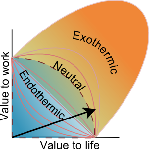
Let’s say you go on a business trip to the city where your favorite cousin lives, who you haven’t seen for a decade. You enjoy a nice dinner together one evening. In utility terms, this is positive work-life chemistry – your company doesn't pay anything extra, and you essentially got a freebie family visit. Or maybe you've been meaning to read a book, but haven't been able to find the time. Then the book suddenly becomes critically relevant to your work, and your boss demands that you read and present a summary at the next team meeting. So you spend a few afternoons at your desk, at work, reading it. Work-life chemistry happens when episodes of work-life blending lead to a non-zero sum outcomes. I made up a way to measure and visualize your work-life chemistry. Here is what it looks like. If the arrow in the diagram below is in the reddish zone, as in this example, you are blending work and life positively. In the blue zone, work-life chemistry is draining you (thinking "dampening" if you like). Let me explain how this works, and show you how to sketch out your diagram and arrow.
The Chemistry Metaphor
I have been thinking about the phrase work-life blending for nearly six years now, and I am surprised I didn’t think of this obvious, chemical extension to the metaphor before. When you blend stuff together, things either react or don’t react. If they react, energy is either sucked up or released (remember endothermic and exothermic from high-school chemistry?).
Let's say you like cooking and eating leisurely dinners. If you bring your work home one evening to meet a deadline, and eat a hurried frozen meal, you had an endothermic, value-draining blending episode. The meet-your-cousin story is an exothermic, value-creating one (aside, if you Google exothermic and endothermic, you'll find cool videos of pretty neat examples. In some cases, endothermic reactions cause the mixture to freeze up!).
Now, while you probably know, via a simple gut-check whether your typical pattern of work-life blending is energy-draining or energizing, it is interesting to conceptualize it a little more clearly. For reasons you don't need to worry about, this method only works for people who are actually reasonably engaged (say 90% plus) with both their work and life, and are trying their best. If you've quit on one or both fronts and are just going through the motions, the method won't work.
Here's how you do it, in 2 steps. This is more complicated than I would have liked, but I couldn't find a way to simplify it further without making the exercise completely trivial/vacuous.
Step 1: Map Your Blending Episodes
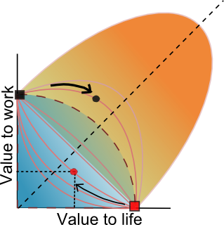
Work-life blenders have complicated, highly-variable life activity patterns. So you have to work with individual well-defined episodes (like 'sitting in a coffeeshop on Thursday afternoon' or 'business trip'). For every episode, represented by a dot, start with whether it was work or life that was dominant, and imagine the episode in pure form (either the black or red square). So for a business trip where you met your cousin, imagine the hypothetical one where you didn't. Next, ask yourself if the blending made the whole thing better or worse. Depending on how much the blending improved/worsened the episode, pick either one of the bulging-out curves in the orange zone or one of the concave ones in the blue zone. The dividing line is the dotted-quadrant line.
Now, slide your dot from its starting point, and along the curve, until you feel it represents the overall work+life value you derived. In some cases, obviously both work and life will increase (bulging-out curves, nearer the squares) -- a win-win. In other cases, one will increase at the expense of the other, with an overall loss or gain.
In the picture above, the red dot represents a life experience contaminated by some work you'd rather not have done, and where you gave up more life-value than you gained in work-value. Your total value is of course the distance of the dot from the bottom-left corner. The black dot represents a case where you added some life to a work-episode, with overall increase in value.
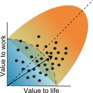
Step 2: The Arrow
Now, plot a lot of such dots. Maybe for a whole week (the more data-driven among you will want to actually use a printed version of this visualization to maintain a real log for a week or more). Once you have a lot of dots, you simply draw an arrow from the bottom-left corner to the rough center of your spread of dots. Of course, you can make things fancier by making bigger dots for longer time durations or something:
1 Comment
Value to work or life differs from day to day and from time to time. In the morning hours, my value to work may be fairly high and dwindles during the course of the day.
The thoughts about the work environment on what is happening around us, the behaviour of the colleagues influence our work as well.